Most blocks lets you customize blocks for desktop, tablet, and mobile devices.You can adjust styling independently for each screen size.
Note: Responsive Controls works with most WordPress and UCLA Design System blocks some custom or third-party blocks may not be fully supported. Styles applied to unsupported blocks may not display as expected.
1. Accessing the Responsive Controls
Select any block in the editor. At the top of the Block sidebar, you will see device tabs for Desktop, Tablet, and Mobile. If the block has a Style tab in the sidebar, your responsive styling controls will appear there.
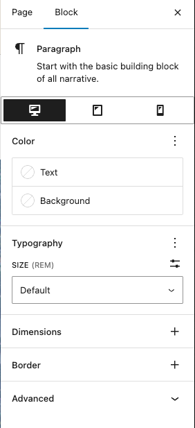
Below the tabs, you’ll find the styling sections, including:
- Color (Text, Background)
- Typography (Size, Line Height, Font Weight)
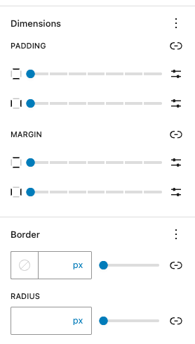
- Dimensions (margin, padding)
- Border (border width, radius, color)
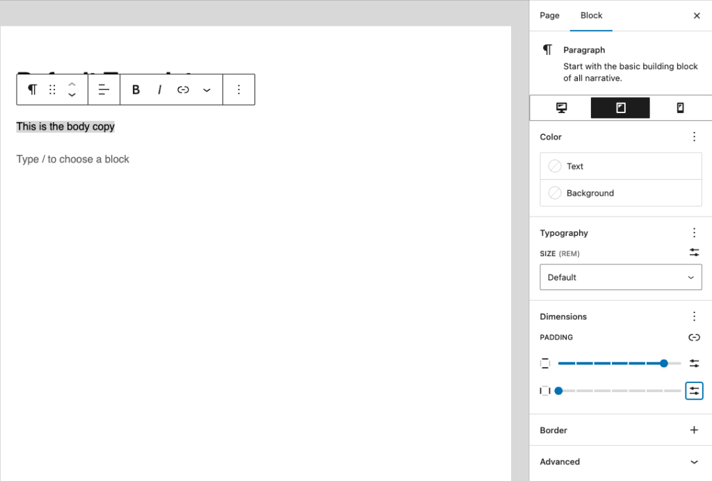
Note: While some styling sections like Color and Typography may be visible, this plugin only supports responsive controls for Dimensions, Border, Column Order and Minimum Height.
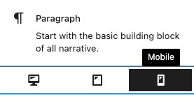
2. Style your block by device
Click the desired device tab (Desktop / Tablet / Mobile).
Adjust the block styles in the sections below:
- Spacing: Dimensions → margin/padding
- Borders: width, radius, color
Preview changes live by switching between device tabs.
Tip: Styles cascade from desktop down to mobile. Any styles you set on the Desktop tab will automatically apply to the Tablet and Mobile views unless you specifically change them. To create a unique style for a tablet or mobile device, simply switch to its tab and make your adjustments.
3. Save your changes
Once you’re satisfied, the styles are applied automatically when you update or publish the page.