Groups and Columns are blocks that will help structure your content. These blocks will provide the flexibility and layout options to create your page/post.
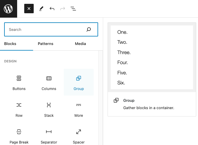
Group Block
The purpose of this block is used to group multiple blocks together in a container. Grouping a block together gives you the option to apply specific styles or layout to a set of blocks collectively.
To add a Group Block, add it from the block library. You can find it under the Design category.
You’ll be able to choose a layout from the following options.
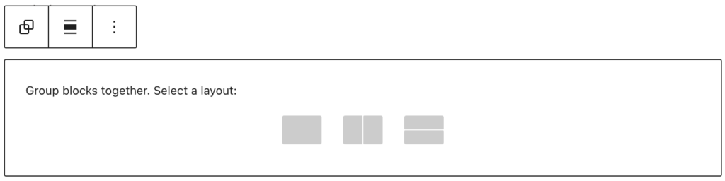
- Group: The default grouping option to arrange inner blocks in a container.
- Row: Organize inner blocks side by side.
- Stack: Organize inner blocks on top of each other.
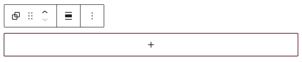
When you select a layout, you can then click on the + to add blocks inside the group
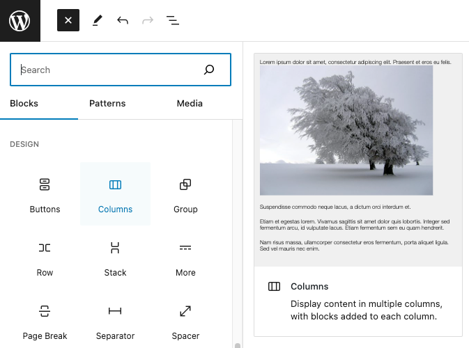
Columns Block
The Columns block is used to create a layout with multiple columns. This gives you the options to devide the content area into two or more columns and place different blocks in each column.
To add a Columns Block, add it from the block library. You can find it under the Design category.
You’ll be able to choose the number of columns to display. You can change the number and width of each column later in the settings.
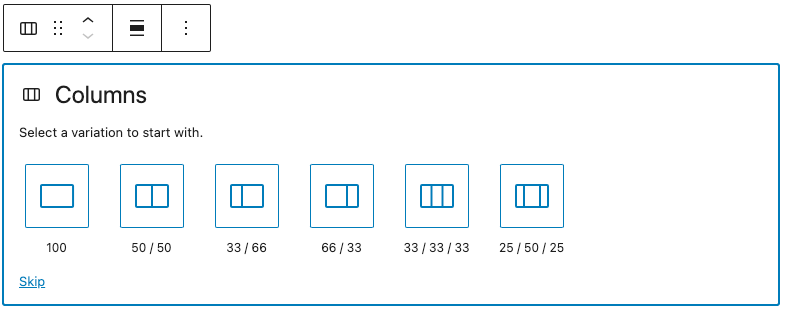
When you select the number of columns, you can then click on the + to add blocks inside the column.
Column Reordering
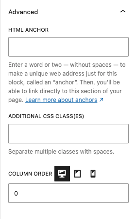
Each column includes a Column Order setting in the Advanced panel. This setting allows you to control the sequence in which columns appear on desktop, tablet, and mobile.
To adjust column order:
- Select a column inside the Columns block.
- Open the Advanced panel in the Block sidebar.
- Locate the Column Order field.
- Use the device tabs (Desktop / Tablet / Mobile) to assign different order values for each device.
Columns with lower numbers will appear first. For example, setting a column’s order to 1 will place it before a column set to 2.
This feature is especially useful for responsive design, where content often needs to be rearranged for readability on smaller screens.
Example: Reordering Columns for Mobile
Desktop Layout (default order)

Ut ex sem, ornare nec lobortis ut, tincidunt eu neque. Mauris bibendum ornare libero sed maximus. Nulla laoreet facilisis imperdiet. Class aptent taciti sociosqu ad litora torquent per conubia nostra, per inceptos himenaeos. Proin urna risus, eleifend sed tempor vitae, mattis mollis libero.
Mobile Layout (reordered using Column Order)
Ut ex sem, ornare nec lobortis ut, tincidunt eu neque. Mauris bibendum ornare libero sed maximus. Nulla laoreet facilisis imperdiet. Class aptent taciti sociosqu ad litora torquent per conubia nostra, per inceptos himenaeos. Proin urna risus, eleifend sed tempor vitae, mattis mollis libero.
By adjusting the Column Order values, the image can remain on the left side of the text for desktop users while moving below the text for mobile users — creating a layout that flows naturally across all screen sizes.